TL;DR:
- Most traders mistake noise for genuine market signals, leading to costly decision errors.
- Effective chart reading relies on simplicity, combining support, resistance, volume, and key patterns for confirmation.
You’re watching a currency pair move sharply on your screen. Something feels significant, but you’re not sure if it’s a real breakout or just noise. That moment of uncertainty is where most trades go wrong. Reading charts is not just a skill for experts; it is the core language of every market, from Forex pairs and stock indices to crypto assets. This guide breaks down chart types, candlestick mechanics, support and resistance zones, volume signals, and technical indicators into a practical framework you can apply right away, no matter your experience level.
Table of Contents
- Chart types and timeframes: the foundation of reading
- Decoding candles and price action
- Support and resistance: mapping critical levels
- Volume analysis: confirming price moves
- Technical indicators: reading signals in context
- A fresh perspective: what most traders miss when reading charts
- Unlock more trading success with expert tools
- Frequently asked questions
Key Takeaways
| Point | Details |
|---|---|
| Learn chart basics | Choosing the right chart type and timeframe sets you up for trading clarity. |
| Understand price action | Reading candlesticks reveals market sentiment and signals potential moves. |
| Identify support and resistance | Mapping critical levels helps plan entries, exits, and manage risk. |
| Confirm with volume | Analyzing trading volume gives confidence that price moves are genuine. |
| Use indicators wisely | Technical indicators are powerful but should be used in context with other tools. |
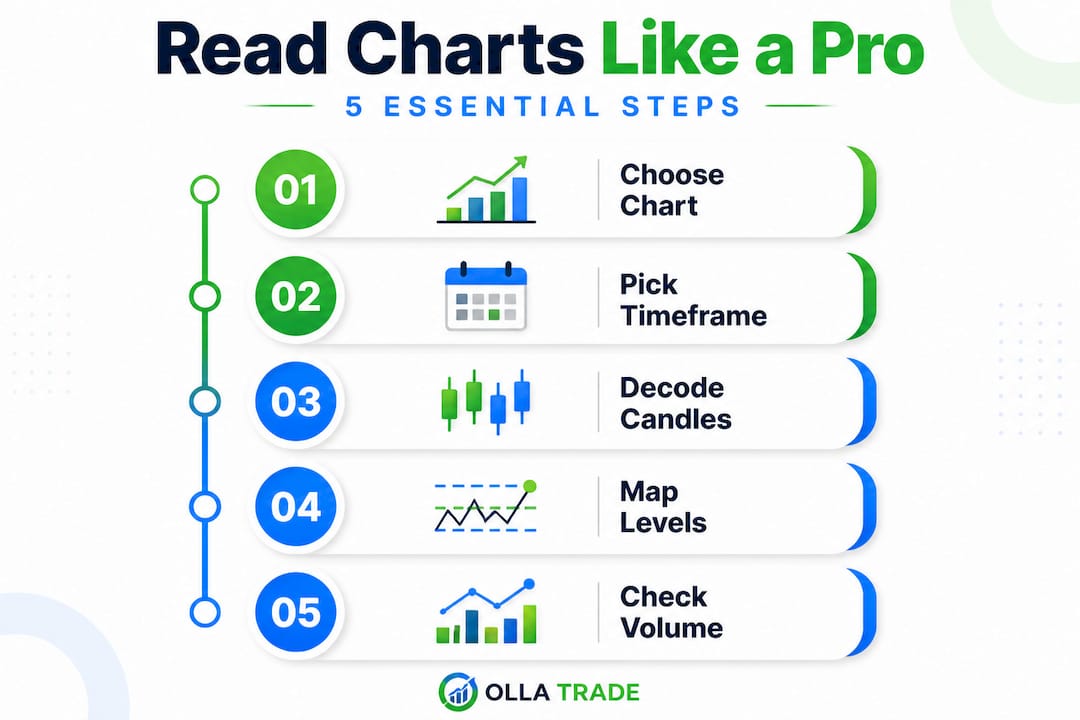
Chart types and timeframes: the foundation of reading
After setting the stage, we begin by breaking down the chart types and timeframes that shape every trading decision.
Not all charts present the same information. Knowing which one to use saves you from confusion before you even place a trade. There are three main chart types in common use across Forex, stocks, and crypto markets.
Line charts connect closing prices over a selected period. They are clean and easy to scan, but they strip out important intraday data. You miss the open, high, and low for each period, which limits what you can learn about market behavior.
Bar charts show four price points per period: open, high, low, and close (commonly called OHLC). A vertical line marks the range, while small horizontal ticks on each side mark the open (left) and close (right). Bar charts give you more context than line charts, but many traders find them visually busy.
Candlestick charts show the same OHLC data but in a format that is far easier to interpret at a glance. According to stock chart reading basics, you should start by identifying chart type and align the timeframe with your trading horizon. A wide body shows the distance between open and close. Shadows (thin lines extending from the body) show the high and low. If the close is above the open, the body is typically green or white (bullish). If the close is below the open, it is red or black (bearish).
Pro Tip: Start with candlestick charts. They pack the most visual information into the least screen space, and most charting techniques build directly on candlestick logic.
Matching timeframes to your trading style is just as important as picking the right chart type. Here is a simple breakdown:
| Chart type | Best for | Typical timeframe |
|---|---|---|
| Line chart | Big picture trends | Weekly, monthly |
| Bar chart | Intermediate analysis | Daily, 4-hour |
| Candlestick chart | Day trading, swing, position | 1-min to weekly |
Different trading account types often pair naturally with specific timeframes. Day traders work on 1-minute to 15-minute charts. Swing traders typically use 4-hour to daily charts. Position traders who hold for weeks or months focus primarily on weekly and monthly timeframes. Picking the wrong timeframe causes you to see signals that are irrelevant to your actual trade horizon, a common and costly mistake.
The trading strategies that fit your style should always guide your timeframe choice, not the other way around.
Decoding candles and price action
Once you’ve chosen your chart and timeframe, understanding candlesticks unlocks the story behind price moves.
Each candle is a compressed summary of market activity for a specific period. The body and shadows encode the open, close, high, and low for that period, with bullish or bearish character determined by whether the close is above or below the open.
Here is what each component tells you:
- Body: The wider the body, the stronger the conviction in one direction. A small body means indecision between buyers and sellers.
- Upper shadow (wick): Shows how high price reached before sellers pushed it back down. A long upper shadow is often bearish pressure at work.
- Lower shadow: Shows how low price fell before buyers stepped in. A long lower shadow often signals buying support.
- Doji candle: When open and close are nearly equal, the body is a thin line. This signals market uncertainty and potential reversal, especially after a strong trend.
Reading a single candle tells you something. Reading a cluster of candles tells you far more. Look at three to five consecutive candles together. Are bodies getting larger or smaller? Are shadows lengthening in one direction? This narrative approach to chart pattern success is where experienced traders separate themselves from beginners.
Pro Tip: Study at least five candles together before forming a bias. A single dramatic candle is often misleading without context. The chart patterns cheat sheet can help you recognize recurring formations in clusters quickly.
Expert warning: Candlestick patterns are context-dependent. A hammer candle at a major support zone carries far more weight than the same candle appearing in the middle of a range. Patterns should never be traded in isolation because their predictive power is strongest in the short term and can produce false signals without additional confirmation.
Support and resistance: mapping critical levels
After identifying chart patterns, mapping support and resistance zones reveals where price moves are likely to pause or reverse.
Support and resistance are arguably the most foundational concepts in chart reading. These levels mark where price tends to reverse or stall, and levels identified on longer timeframes are generally more significant than those on shorter ones.
Support acts like a floor. It is a price zone where buying pressure has historically exceeded selling pressure, causing price to bounce upward. Resistance acts like a ceiling, where selling pressure has overcome buying, pushing price back down.
Why do these levels form? Because traders have memory. A price point where a lot of orders were triggered or where the market reversed dramatically becomes a reference point for future behavior. Institutional traders and algorithms alike use these zones.
Here is a step-by-step process for marking key levels on any chart:
- Switch to a higher timeframe (daily or weekly) to identify the most significant price zones first.
- Look for areas where price reversed sharply at least twice. Two touches create a level; three or more create a zone.
- Mark these zones on your chart using horizontal lines or shaded boxes, not exact price points, because support and resistance are zones, not lines.
- Drop to your trading timeframe and see how price behaves as it approaches these zones.
- Combine your support and resistance techniques with candlestick signals at these zones for higher-probability setups.
A key concept that many traders ignore: role reversal. When price breaks through a resistance level and holds above it, that level often becomes support. The opposite also applies. This principle is consistent across Forex, stocks, indices, and crypto markets.
| Asset class | Common support/resistance sources |
|---|---|
| Forex | Round numbers, previous session highs/lows, pivot points |
| Stocks | Earnings gaps, prior highs/lows, moving averages |
| Crypto | All-time highs, round numbers, previous cycle peaks |
| Indices | Previous day close, weekly open, historical range extremes |
Plan your entries and exits around these levels rather than reacting emotionally to price movement in between them.
Volume analysis: confirming price moves
After marking support and resistance, volume analysis adds a crucial layer of confidence to price moves.
Volume tells you how many units were traded during a given period. Price movement without volume is like applause without an audience. It looks like something is happening, but there is no conviction behind it. Volume analysis validates that price moves carry real market participation, which is essential for distinguishing trending moves from noise.
Here are the key signs that volume confirms price conviction:
- Rising price with rising volume: Strong uptrend. Buyers are active and increasing in number.
- Falling price with rising volume: Strong downtrend. Sellers are in control and accelerating.
- Price rise with falling volume: Weak move. The trend may be losing steam. Be cautious about adding to longs.
- Volume spikes at support or resistance: A spike in volume as price tests a key level often signals that the level will hold or break decisively.
- Low volume consolidation: Often precedes a breakout. Watch closely for the direction.
Pro Tip: Before acting on any breakout through support or resistance, check trading volume insights. A breakout on low volume is a red flag. Real breakouts are typically accompanied by a notable surge in volume that shows genuine market participation, not just thin-market noise.
Volume is especially useful in Forex, where retail traders cannot see actual order flow the same way equity traders can. Relative volume indicators and tick volume on platforms like MetaTrader 4 serve as practical substitutes.
Technical indicators: reading signals in context
Finalizing your chart analysis, technical indicators add nuance and predictive power when used thoughtfully.
Technical indicators are mathematical signals derived from price, volume, or open interest data. They fall into two broad categories: overlays and oscillators.
Overlays appear directly on the price chart. The most widely used are:
- Moving averages (MA): Smooth price data to reveal trend direction. The 50-period and 200-period moving averages are widely watched across all asset classes.
- Bollinger Bands: Two bands plotted two standard deviations above and below a moving average. When price touches the outer bands, it often signals overbought or oversold conditions relative to recent action.
Oscillators appear in a separate panel below the price chart and measure momentum or trend strength:
- RSI (Relative Strength Index): Measures the speed and change of price movements on a scale from 0 to 100. Readings above 70 suggest overbought conditions; readings below 30 suggest oversold conditions.
- MACD (Moving Average Convergence Divergence): Shows the relationship between two moving averages. Crossovers and divergences from price action are its primary signals.
Candlestick patterns and indicators share a common weakness: their predictive power is mostly short-term, and relying on either alone can mislead you into bad trades.
Common mistakes traders make with indicators:
- Using too many indicators at once, creating signal conflicts and confusion.
- Treating a single indicator cross as a definitive buy or sell signal.
- Ignoring the underlying price structure and key levels when an indicator fires.
- Applying oscillators in strongly trending markets where they stay overbought or oversold for extended periods.
The essential indicators explained approach that professional traders use is not about stacking more tools. It is about understanding how each indicator behaves in different market conditions and combining them with context.
Pro Tip: Use advanced charting tools to layer one overlay and one oscillator onto clean price action, with support and resistance levels already marked. That simple setup is far more powerful than a chart cluttered with five conflicting indicators.
A fresh perspective: what most traders miss when reading charts
Here is something that most trading courses won’t tell you directly: the biggest problem most retail traders have is not that they lack enough indicators or patterns. It is that they see too many signals and act on them without proper context.
Every pattern you learn, every indicator you add, creates a new opportunity to second-guess yourself or jump into low-quality setups. We see this constantly. Traders who have studied for months still struggle not because their technical knowledge is weak, but because they treat charts like a puzzle that has one correct answer waiting to be found.
The real edge is remarkably simple. When your support and resistance levels agree with your candlestick signal AND volume is confirming AND your one chosen indicator aligns, that is a high-probability trade. When only one of those things is true, it is usually not worth taking.
Pattern success lessons consistently show that the traders who outperform are not the ones using the most sophisticated methods. They are the ones who have disciplined rules about when NOT to trade. Fewer, better trades beat more frequent, uncertain ones every time.
The uncomfortable truth about chart reading is this: clarity only comes from simplicity. A clean chart with two or three tools used consistently is worth more than an overwhelming setup that makes every bar look like a potential trade. Focus on confirmation, not complexity. Let the market tell you when conditions are right rather than forcing a signal out of every price move you see.
Unlock more trading success with expert tools
Knowing how to read charts is only the beginning. The platform you use to analyze and execute your trades makes a real difference in how effectively you can apply everything in this guide.
Olla Trade gives you access to professional-grade advanced charting tools built for traders who take analysis seriously. From customizable candlestick charts to integrated technical indicators and MetaTrader 4 support, every feature is designed to help you move from interpretation to execution with confidence. Whether you trade Forex, CFDs on metals and indices, or cryptocurrencies, the platform puts the right tools in your hands without overcomplicating your workspace. Start building your chart reading practice on a platform that matches your ambition.
Frequently asked questions
What is the best chart type for beginners?
Candlestick charts are the best starting point because they display open, high, low, and close in a visually intuitive format that matches most trading education resources.
How do support and resistance levels affect trades?
Support and resistance levels mark zones where price has historically reversed or paused, giving traders logical places to plan entries, exits, and stop-loss placement.
Can I rely solely on candlestick patterns to predict price moves?
No. Candlestick predictive power is limited mostly to the short term and patterns can produce false signals, so always confirm them with volume, support and resistance, and at least one additional technical tool.
How does volume analysis improve chart reading?
Volume analysis confirms whether a price move has genuine market participation behind it, helping you separate real breakouts and trend moves from low-conviction noise.
Why should technical indicators be used with caution?
Indicators can produce misleading signals when used alone. The most effective approach is to use them with context, always cross-referencing with price structure, support and resistance levels, and volume before acting.